Top 10 Pizza Restaurant Menus in the USA
By Dazzle Pixels — Masters of Menu & Print
Do you want your pizza menu to be as mouth-watering visually as your pies are on the palate? Here we explore the best pizza restaurant menus in the USA, how their designs work, and what makes them irresistible. If you’re ready to upgrade your own menu, check out our Shop for premium printing & finishes, or our Menu Design service to get everything concepted, crafted, and delivered with Dazzle Pixels quality.
1) Pizzeria Bianco — Rustic Elegance & Artisan Craft
What makes it special: Phoenix’s beloved pizza pioneer, known for wood-fired crusts, farmed toppings, artisan technique.
Menu design:
• Natural textures (kraft paper, light wood grain), hand-lettered titles in imperfect scripts, muted earthy tones with deep reds and olive greens.
• Imagery is minimal — one hero shot, subtle ingredients.
• Compact layout: pizzas first, followed by small plates, salads, etc.
Image / Menu link:
• You can view several images of the Pizzeria Bianco menu and photography on Yelp: Pizzeria Bianco menu photos — Yelp Phoenix
• Their “Menus & Hours” section also shows the items clearly at Pizzeria Bianco Heritage Square (Phoenix) page.
Takeaways: Use texture to signal craft; limit imagery so the food story feels genuine; earthy palettes work well for artisan pizza.
2) Roberta’s NYC — Hip & Eclectic Local Flavor
What makes it special: Brooklyn icon, wood-oven pies, communal vibes, creative toppings.
Menu design:
• Bold typography mix: sans serif for section headings, playful scripts for pizza names.
• Bright accent colors (turquoise, red), illustrated doodles of ingredients.
• Casual and approachable layout; digital and print menus are aligned.
Image / Menu link:
• You can see menu images for Roberta’s via WhereYouEat (“Roberta’s Pizza Restaurant in Brooklyn / Menus & Photos”) which shows several scans/pictures of their printed menu.
• There’s also a “Roberta’s menu - Picture of Roberta’s, Brooklyn” via TripAdvisor.
• Their official “Menus” tab on their site shows their current offerings.
Takeaways: Let personality shine through with small illustrative elements; maintain consistency online and print.
3) Gjelina Take Away — Minimal & Clean L.A. Aesthetic
What makes it special: California style: seasonal, fresh, market-driven.
Menu design:
• Lots of white space; neutral palette (cream, light gray, soft charcoal), clean sans serif typography.
• Modest imagery (ingredient close-ups), grid-based layout that’s easy to scan.
• Elegant and quiet — lets the food speak.
Takeaways: When toppings change often, simple grid and clean type helps guests digest quickly; neutrals let photos and items pop.
4) Patsy’s Pizzeria — Classic New York Heritage
What makes it special: Over 80 years in the game, thin crust, coal-oven style.
Menu design:
• Traditional serif fonts, historic photos, red/white checkered patterns as accents.
• Signature pizzas highlighted; sides/desserts in smaller print.
• Nostalgic, comforting visuals.
Takeaways: Use nostalgia elements to reinforce legacy; accent colors can pay homage to historic décor.
5) Pizzana — Upscale Neapolitan & Sophisticated Presentation
What makes it special: Neapolitan style with upscale finishes; chic interiors.
Menu design:
• Luxurious paper stock; foil embossing on logo; black & gold or deep navy header accents.
• Elegant serif titles; subtle illustrations of ovens or herbs; restrained use of photography.
• Balanced layout: premium items get breathing room.
Takeaways: If brand is premium, invest in special materials; use contrast to evoke luxury.
6) Una Pizza Napoletana — Focus on Origin Story
What makes it special: Rooted in Neapolitan tradition; founder’s personal narrative; ingredient sourcing central.
Menu design:
• Story sections (“Our Dough”, “Our Fire”) up front; typographic emphasis on origin.
• Script accent fonts; warm terracotta, burnt orange, soft cream tones.
• Layout treats the narrative almost as equally important as the food items.
Takeaways: Place origin story front and center; warm tones reinforce fire & oven heat; narrative builds authenticity.
7) Mozza (Nancy Silverton’s) — Detail & Ingredient Focus
What makes it special: Top-tier ingredients, chef reputation, fine dining hybrid.
Menu design:
• Elegant layout with small blurbs about farms/cheeses; photos of raw ingredients or process.
• Clean typography; thick stock print; textured paper.
• Supporting items (sides, drinks) in secondary position.
Takeaways: If sourcing is a selling point, call it out; tactile print materials add perceived value; design hierarchy matters.
8) Blaze Pizza — Fast Casual, Bold & Fun
What makes it special: Build-your-own, fast casual, young demographic.
Menu design:
• Digital menu boards with bold sans serif fonts; bright accent colors like fire-red, orange, yellow.
• Icons or photos of toppings; build steps visually (“pick your crust → sauce → toppings → bake”).
• The print menu is folded for portability or counter display.
Takeaways: For fast casual, legibility + flow matter; icons speed up decision; bright accent tones increase appetite.
9) Serious Pie (Portland/Seattle) — Upscale & Contemporary Pacific Northwest
What makes it special: Inventive toppings, wood fire, chef-led.
Menu design:
• Matte black covers, silver foil logos, purposefully wide margins.
• Bold section heads; ingredient/origin info under each pizza.
• Sparse photography — used as impact moments (full spread or hero shots).
Takeaways: Dark backgrounds with light text feel dramatic and modern; highlight provenance; let visuals breathe.
10) Sbarro (Flagship / Retail Focus) — Nostalgic & Accessible
What makes it special: Mall staple, wide reach, familiar slices.
Menu design:
• Bright yellow/red color scheme; large photos of slices & combo deals.
• Sections for “slices”, “combo deals”, “specials”, etc.
• Big pricing; consistency across signage, print, digital.
Takeaways: For high volume, fast decisions, use imagery and loud colors; consistency across all touchpoints.
Best Practices Across These Top Pizza Menu Designs
• Use bold headings + clear section breaks so guests can scan quickly.
• Make signature items obvious — via styling, placement, or visuals.
• Reflect your brand (heritage, speed, premium quality, local sourcing) through color, material, type.
• Balance imagery: too much can clutter; too little can feel sterile.
• Carry consistency across shopfront, signage, online menu, print.
Ready to Build Your Best Pizza Menu Yet?
At Dazzle Pixels, we craft menus that don’t just list pizzas — they tell brand stories, guide choices, and make customers hungry.
• Explore our Shop for premium paper stocks, special finishes, and the print options that elevate first impressions.
• Check out our Menu Design service — from concept to final print.
Let’s make your pizza menu the one they keep coming back to.
-
 What Company Makes the Best Restaurant Menu Design Near Me?
Have you ever thought about how much impact a restaurant menu has on your business? Customers might not have tasted your dishes yet, but the very firs...
-
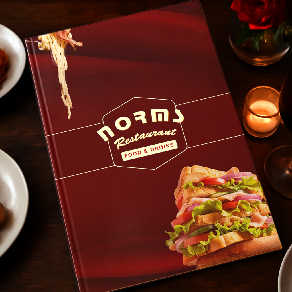
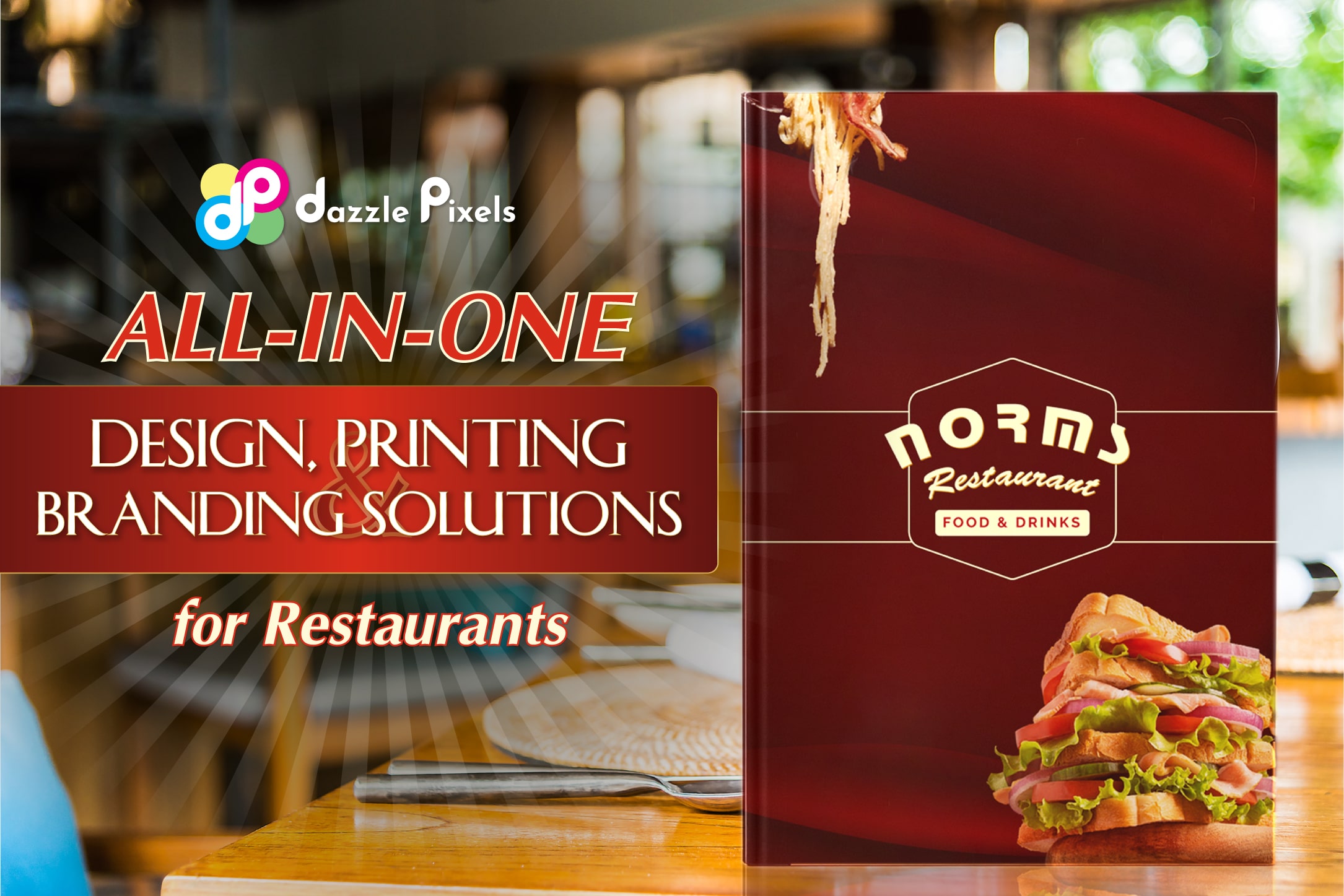 Dazzle Pixels – All-in-One Design, Printing, and Branding Solutions for Restaurants
When customers search for design and printing services near me, they want more than just cheap flyers or menus. They want a partner who understands br...
-
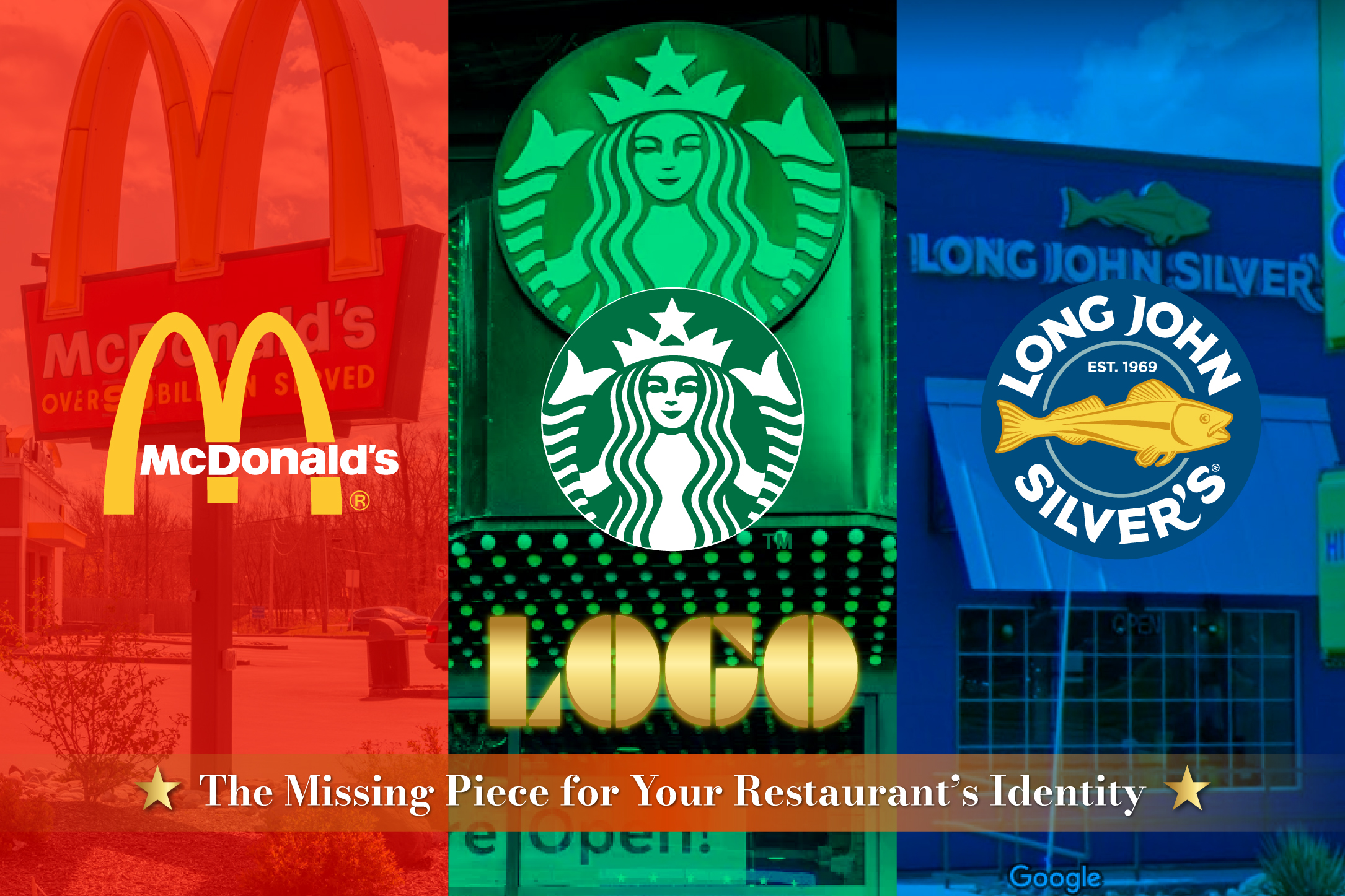 Logo: The Missing Piece for Your Restaurant’s Identity
In the restaurant and service industry, a logo is incredibly important. It helps your restaurant stand out, creates a lasting impression on customers,...
-
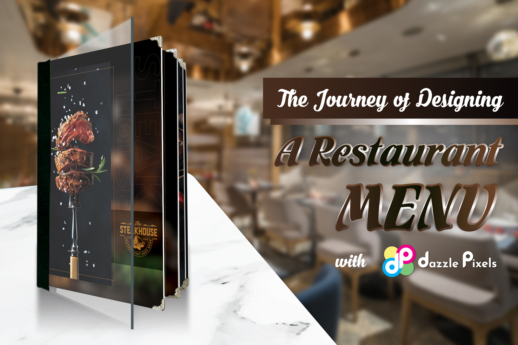 The Journey of Designing a Restaurant Menu with Dazzle Pixel
How to Get the Most Affordable Menu Design When starting my own restaurant and wanting to save costs while learning about market prices before launch...
-
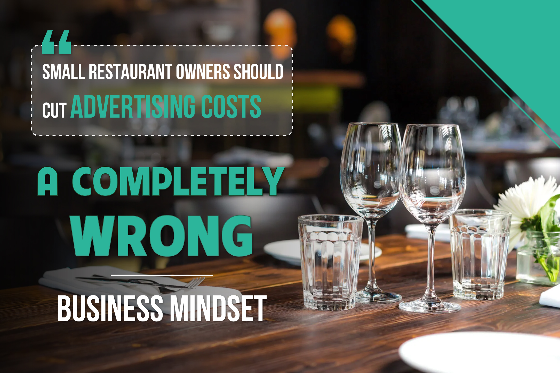 "Small Restaurant Owners Should Cut Advertising Costs" – A Completely Wrong Business Mindset
The Wrong Idea About Saving on Advertising Many new business owners or small restaurant owners, especially those with low profits, tend to have the m...
-
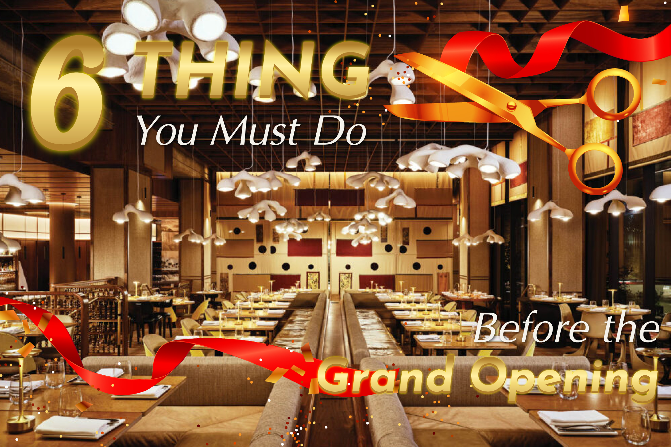 6 Things You Must Do Before the Grand Opening of Your Restaurant
1. Create Your Restaurant’s Social Media Pages This is undoubtedly the most important thing to do before your restaurant’s grand opening. Online mark...